UX
Artificial Intelligence
iOS
Back Story
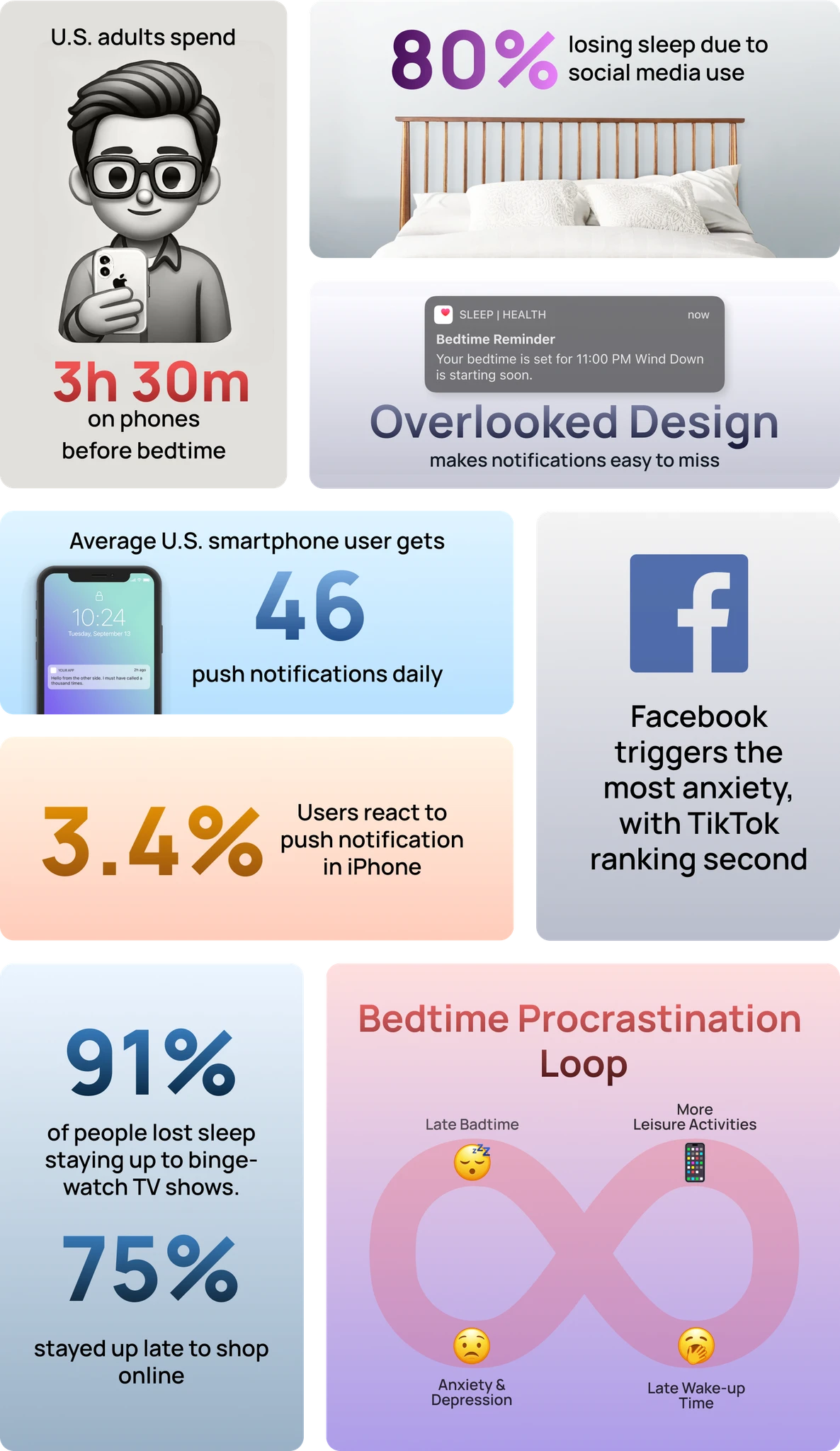
Many iOS users struggle to maintain healthy sleep habits due to ineffective sleep reminders. Current notification designs often fail to engage users, leading to “reminder fatigue” and procrastination. This behavior negatively impacts sleep quality, creating irregular patterns that harm long-term health and productivity.
Putting on user's shoes
To understand user pain points, I employed a mixed-method research approach:
I distributed a survey to understand sleep habits, receiving responses from 40 participants.
I conducted one-on-one interviews with 5 users to gain deeper insights into their sleep routines.
Findings

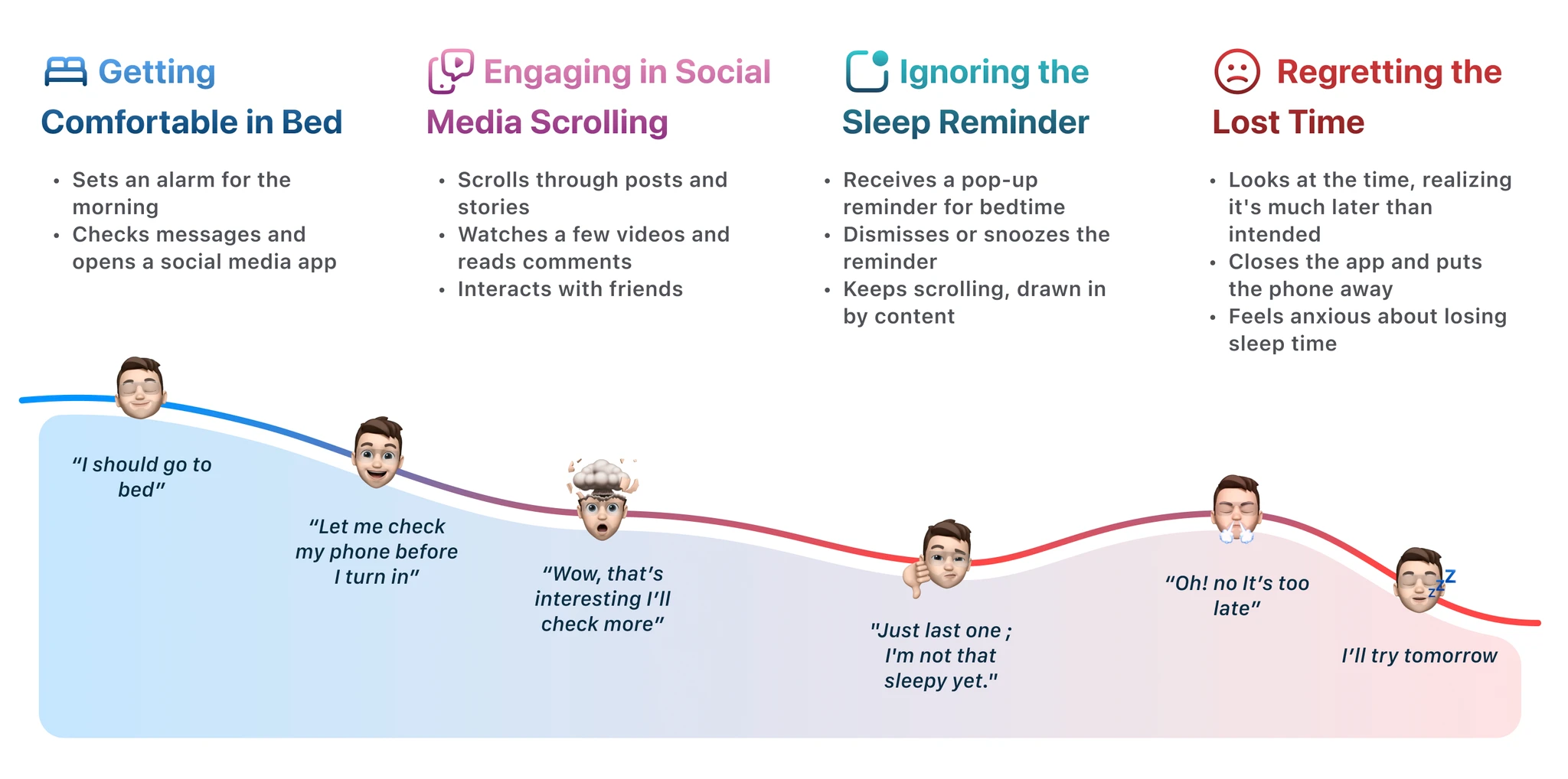
Nighttime User Story
To better understand user needs and their pain points, I conducted mixed
Meet a college student juggling academics, social media, and extracurriculars. With only 6-7 hours of sleep on school nights, he feel constantly stressed and tired, seeking a solution to sleep on time.
Opportunities
🧠
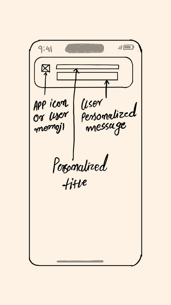
Emotional Connection: Personal, engaging reminders with relatable visuals or messaging.
📈
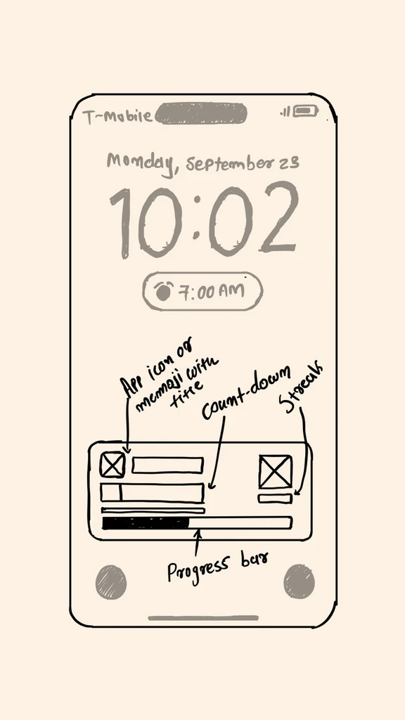
Habit Reinforcement: Include streaks or progress trackers to motivate users.
🌃
Calming Visual Cues: Use soothing visuals for a restful environment.
⏳
Mindful Delay Options: Flexible, intentional postponement options with progress indicators.
I transformed user pain points into design concepts, bridging the gap between intentions and actions.
New Design to ZZZ on Time
New Europa Ocean Design to ZZZ on Time
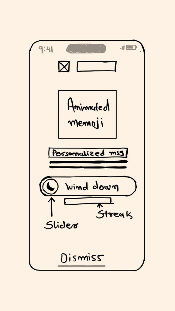
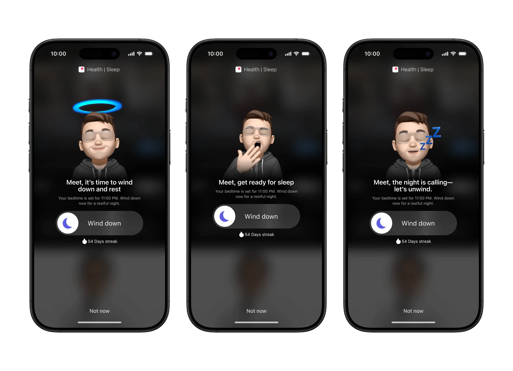
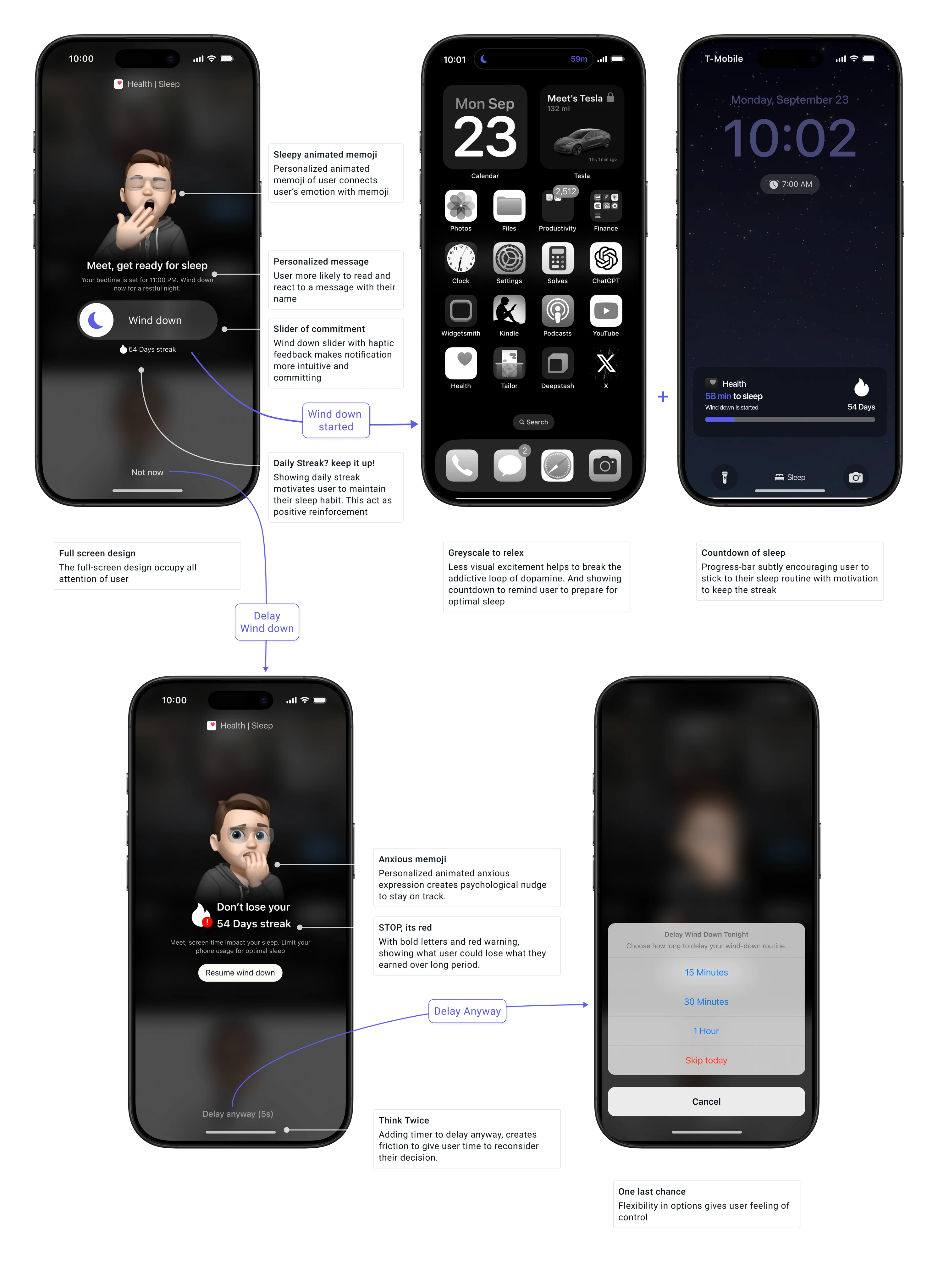
A full-screen sleep reminder with a personalized Memoji and dynamic message, encouraging the user to wind down. A slider activates wind-down mode with haptic feedback, turning the screen greyscale to minimize stimulation. The lock screen displays a live countdown to bedtime and streak tracking, promoting consistent sleep habits.
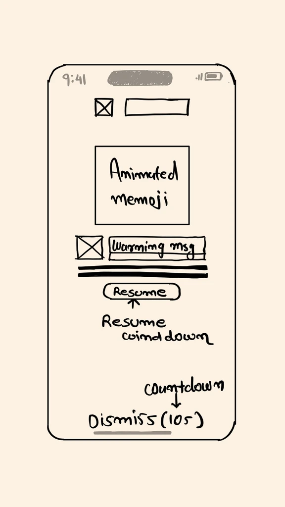
Tapping "Dismiss" reveals an anxious memoji with a warning to protect the streak and a reminder about healthy screen time. Users can resume wind-down or, after a 5-second pause, choose delay options like 15 min, 30 min, 1hr, or "Skip Today".
Dynamic Designs, Fresh Every Night
AI ensures each notification feels new, with personalized messages, Memoji animations, and dynamic visuals.
Flow Visualization
Design solution features a full-screen sleep reminder with a personalized Memoji, a dynamic wind-down slider, and a streak tracker for motivation. Greyscale mode reduces stimulation, while an anxious Memoji and countdown nudge users to reconsider delays. Flexible delay options balance control with encouragement for better sleep habits.
Measuring the Potential Impact
adf
After implementing the design, I conducted a user survey with 31 responses to evaluate its impact:
87%
found the full-screen design more attention-grabbing than the previous notification style
67%
reported countdown timer to delay and anxious design style with red warning message gave motivation and time to reconsider choice
interactive slider was rated the most appealing new feature by 78% of surveyed users
The redesigned sleep reminder received an average satisfaction rating of
8.2/10
compared to 6.1 for previous design
Areas for Improvement
While engaging, some users felt stressed by constantly changing designs. Millennials reported mild difficulty adapting to the new visual complexity.
Final Thoughts
This project reimagines Apple’s sleep reminder notifications, blending user psychology, AI, and interactive design. The full-screen visuals and personalized content drive engagement, aiming to improve sleep habits.
Through this case study, I honed my skills in AI integration, user engagement, and habit-forming design strategies, tackling real-world problems with innovative solutions.
. . .

