UX Design
Travel and Booking
Responsive Design
PROCESS HIGHLIGHTS
Design challenge and responsibilities overview
Challenge
Design a platform that provides comprehensive control and relevant information to simplify the accommodation booking process for travelers.
Opportunity
Build a smarter booking platform that personalize recommendations, enhances user confidence, and sets a new standard for informed decision-making in travel planning.
Responsibilities
UX/UI Design
Sketching
Prototyping
Tools
Figma
Adobe CS
Procreate
Timeline
2 weeks
BACKGROUND
Our Vision
Our vision for Voyagr is to redefine the way travelers discover accommodations by creating a platform that feels like a trusted travel companion. We aim to empower users with personalized recommendations, insightful information, and intuitive tools, helping them confidently plan getaways that align with their unique preferences. Through Voyagr, we envision a future where booking accommodations becomes an inspiring and effortless part of the travel experience.
The Process
RESEARCH
Initial Problem Discovery
Steve, the founder of Voyagr, encountered a problem when booking accommodation for his getaway to {Lake Crackenback, NSW, Australia} with his partner. He noticed a lack of relevant and supportive information, as well as controls to help him refine his search for accommodations that met his specific needs and preferences.
RESEARCH
Desk Research
Before diving into designs, I wanted to first look at websites and articles from Google's Search Engine that mentioned key statistics to be mindful of from both the consumer and the brand perspective.
Complexity
Lengthy forms, unclear steps, and hidden fees discourage users. Streamlining with fewer steps, pre-filled fields, and transparent pricing can ease the process.
Trust and Transparency
Users want secure payments, clear cancellation policies, and no hidden fees. Without these, trust declines, hurting conversions.
RESEARCH
Competitor analysis
I selected three popular travel booking platforms Airbnb, Booking.com, Expedia, and conducted competitive analysis.
Overall Airbnb is scored 9 as a direct competitor when it comes to competitiveness. Booking.com and Expedia are both ranked around ~6 as an-indirect competitor, as they are primarily focused around hotels. Booking.com does have a fairly well designed experience with a strong loyalty program.
RESEARCH
User Surveys & Interviews
Conducted user surveys and interviews with individuals who use the competition platform on regular basis. The purpose behind the research initiative was to help us gain deeper understanding of the accommodation booking experience for traveling couples.
The current process for researching and booking accommodation for couples.
The biggest struggles and frustrations for couples when they are traveling.
The unique preferences of what travelers look for in accommodation.
The non-negotiable when it comes to booking accommodation
What motivates a traveler(couples) to book on one platform over another.
5.1/10
Avg. researching experience score
9/10
Avg. booking experience score
80%
Participants voiced activities + accommodation
53%
Abandoned their cart due to hidden fees added during checkout
RESEARCH
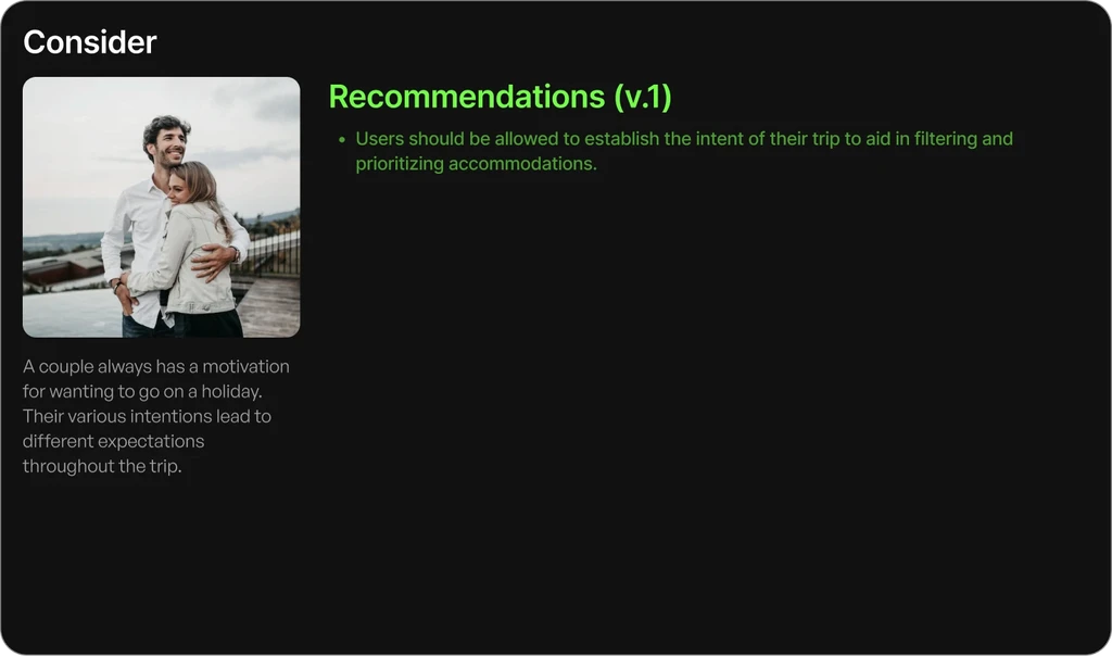
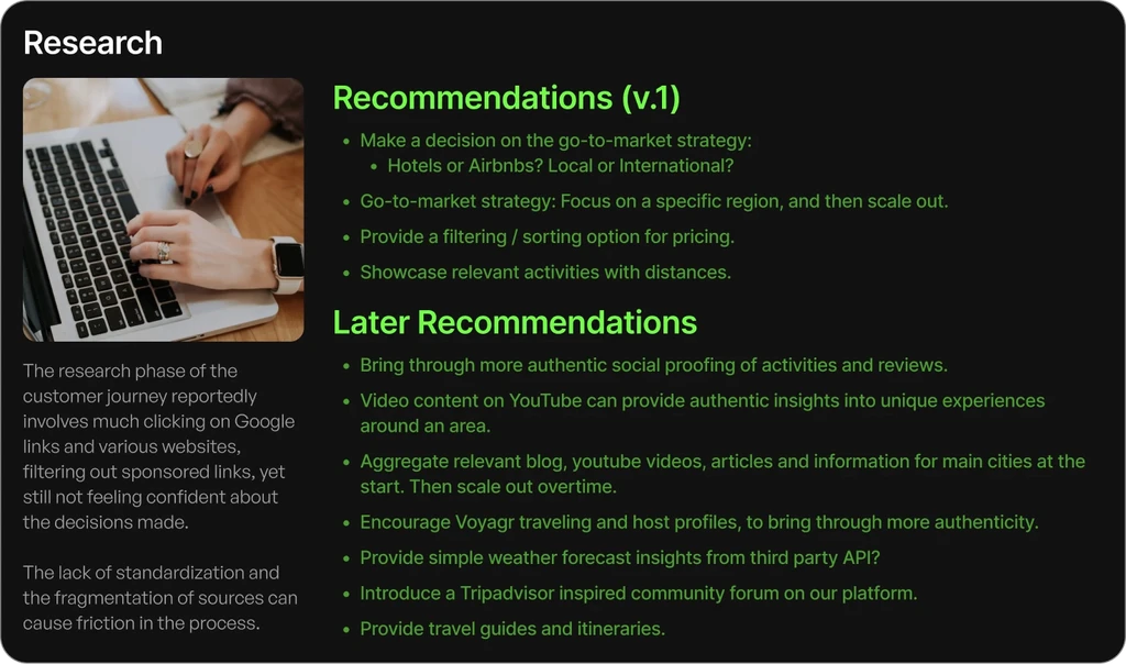
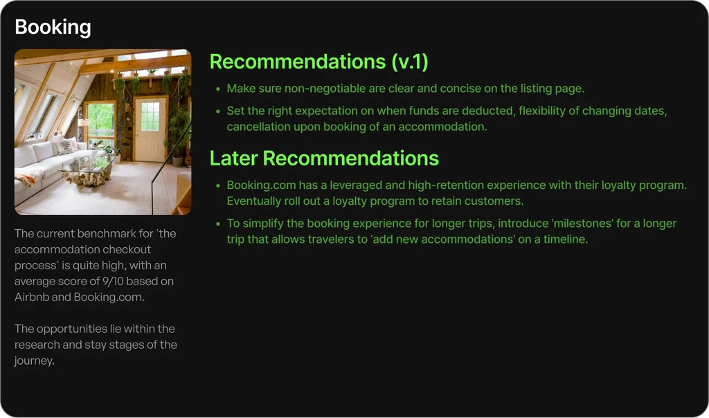
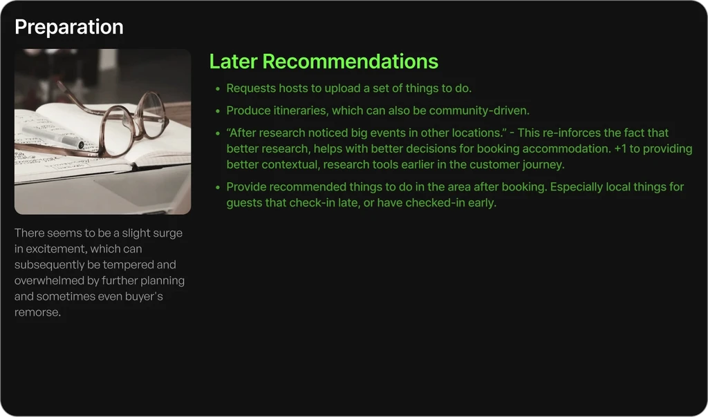
Insights & Recommendation
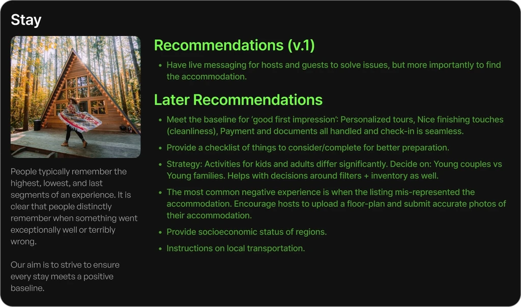
We defined key friction points in the booking journey, highlighting opportunities to simplify the research process and improve personalization.
SYNTHESIS
User Persona
Incorporating insights from the problem discovery, user surveys, competitor analysis, and major pain points. By synthesizing the gathered data, my aim is to represent the user's preferences, pain points, and behaviors, allowing for a more focused and effective redesign for our ideal user.
Just Married Justin & Jasmine
long-term relationship/ Married with no kids.
Full-Time
Married
Sydney, NSW
A young married couple eager to create unforgettable memories together. They want to enjoy meaningful travel experiences that align with their budget and taste of culture, leisure, and romance.
Frustrations
Struggling to find accommodations that balance affordability with unique, romantic experiences.
Difficulty identifying nearby activities that are both convenient and aligned with their preferences.
Overwhelmed by too many options and unsure if they're making the best choice
Emotional state during the process
IDEATION
Userflows and Sitemap
I started by mapping out user flows to understand how user would navigate through the Voyagr to complete their goals. Once the flows were clear, I created a sitemap to organize the Voyagr's content in a way that feels simple and easy to navigate. Together, these steps helped lay the foundation for an intuitive and user-friendly experience.
IDEATION
Moodboard
Following the User Flows, I delved into researching mobile apps and websites renowned for their exceptional experience and user interface design. This research served as a valuable resource for my ideation process, as it enabled me to generate ideas based on designs that have successfully delighted users. Additionally, it helped me identify essential elements that should be included in the app, as well as discern what features may be unnecessary.
IDEATION
Mid-Fidelity
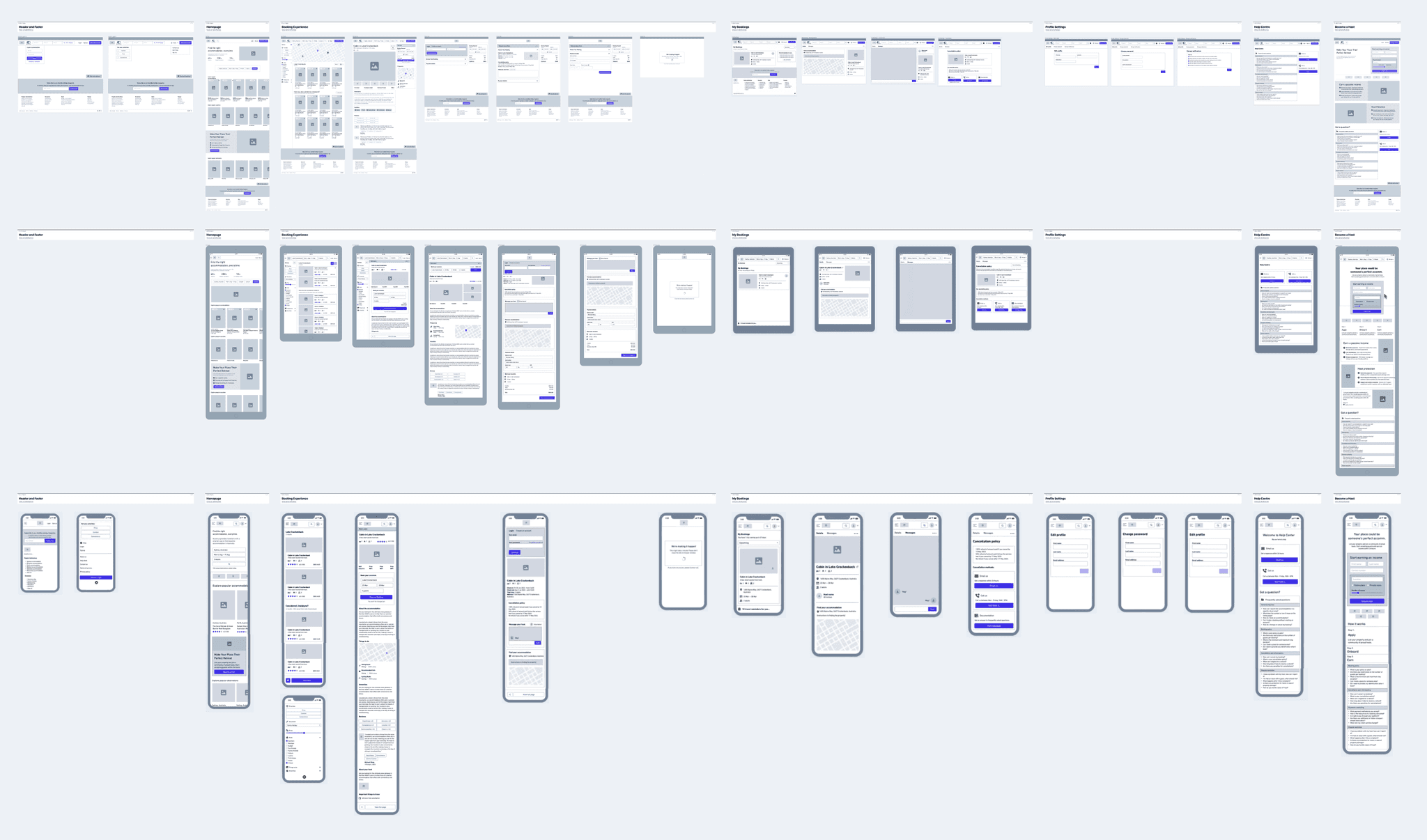
Next, I created wireframes to outline the app's structure and key interactions. These simple layout focused on functionality, ensuring the design aligned with user needs before moving into visual details.
FINAL DESIGNS
Design Systems
Coming Soon…
